
When Comic Sans isn’t being used to torture the eyes of the public, Curlz makes up as its partner in crime. Although this font is not misused as much as Comic Sans, it still is a cliché for anything girly, young, whimsical, or goofy for that matter. Thus, the widespread dislike of Curlz by graphic designers everywhere.
History
Carl Crossgrove and Steve Matteson designed our lovely subject of discussion in 1995. They worked for Agfa Monotype, a highly recognized type company that is still in operation today. Matteson also designed a number of other well-known subjects, including the font “Cambria,” the Droid and Android fonts, and the user interface for Xbox and Xbox 360. It is said that Curlz does not have a particular inspiration, contrasting to most other type, however it can compare to the Emigre Foundry’s 1991 typeface, “Remedy.” (Emigre is another well-known design company, located in Berkley, California.) Like Comic Sans, Curlz Mt was part of a number of Microsoft packages in the late 90s. This is probably where the font gained its popularity and familiarity.
Style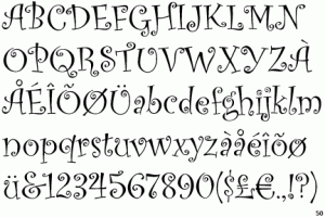
With it’s wavy stokes and swirling serifs, Curlz is not easily mistaken. As I mentioned earlier, this font does not have a
particular inspiration as to where this style came from. This can be clearly seen in the look of this typeface because it differs from most popular and ordinary fonts. One can assume, however, that more of a modern look was being shot at according to the contrast between the thick and the thin strokes in the letters. However, one could argue that statement because even the strokes themselves are not one consistent width. Some glyphs have strokes that taper in thickness to accommodate the ornamental swirls, or curls for that matter, that replaces some of the serifs that should be present. One can also easily tell that this font is modern because there is no way it would have started out being drawn by hand with a calligraphy pen. All of the curls are very uniform, which would be hard to achieve the old fashioned way by hand. This all goes back to the point of this being a modern, digital, and independent font with no inspiration or base.
An example of how Curlz is used
Criticism
Like I mentioned in the introduction, Curlz MT is like Comic Sans’s evil comrade. It tries to force the casual feel and gets bonus points because it really shouldn’t be used in body copy even though it often is. A lot of times people will use this in their email signatures, which just screams unprofessional. It is said that people use Curlz just to spice up a dull subject, like an instructional sign in a store or in an email reminding your BFF that you have a shopping date. It is also used just when people want to make something a little jazzier but don’t know the proper design skills to do so—so they pick this crazy font. For example, take old ladies who open up a little boutique, soccer moms who want to seem fun, failing cheerleaders in high school who want to add personal flair to their essay; these are the kinds of situations where Curlz comes out to play, and the game is not fun in the least.
When to Use Curlz (If You Must)
Just don’t. Comic Sans has the legibility for 5 year olds going for it at least, but Curlz is nearly impossible to read. Not to mention, there are other whimsical and fun fonts out there that could get the point across in a much more eye pleasing way.
Source
“America’s Most Fonted: The 7 Worst Fonts.” LMNOP. 2006, October. Accessed online June 2, 2014.

Pingback: Font Hate? Curlz | Devon Rae